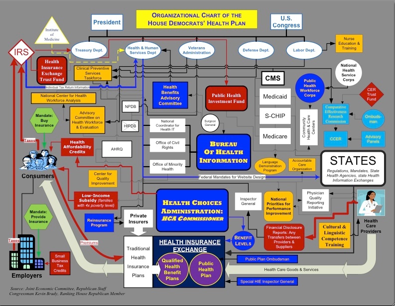
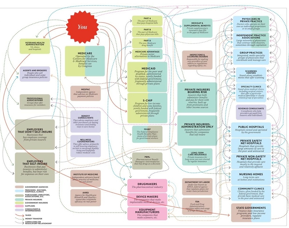
Scary charts. Are they helpful? The actual way health care plans work without these charts are virtually impossible to imagine. In reality though, all that we care about is how our doctor, our medicine and our family will be effected on a daily basis. Charts or visualizations are just an easier way to see complex things. This same information in a list or PowerPoint would be unimaginable.
Problem:
Collaboration, just like health care has to many options, many of which are not clearly understood. How do you make sense of it all?
Solutions:
+ Visualization: Graphic Facilitation, white board use, brown paper spreads, flip charts, anything that lets you work larger than paper and enables multiple people to work on the same thing at the same thing... while not being encumbered by technology (Proxima's or projectors or death ray machines are not allowed.)
+ Set a visual note taker. No, not a list taker or meeting minutes taker. No, not someone on their laptop or with a small piece of paper. They must be on their feet. Everything they write down must be seen by everyone. If it is seen by everyone, it is inherently agreed to by everyone. Then take a picture of it. Send out the picture within minutes of the meeting being finished. Ad to-do's to your central to do list. Don't put it in a Word document. It will never be opened! Use JotNot or Pixid WhiteBoard or Evernote to capture your work.
+ Empathy: "Listening is not waiting to talk." Scott Ginsberg
+ Context: Simply set the context for where, what, how and when you are working. Setting the parameters can make everything go more smoothly.
+ Intimacy: Statistics show that the longer a doctor spends with a patient, the less likely there will be a lawsuit. Share your feelings around the topic at hand. A little balanced emotion for every project, event or meeting can be incredibly powerful and ensure a long lasting solution.

